Top 5 network views for daily operations and diagnostics
What views are most popular for a quick network health overview? Tips from fellow engineers and sysadmins for starting your day well-informed.
We have asked sysadmins and network engineers how they quickly get on track with their network health at the beginning of the day. Do they run the NetCrunch console for a brief checkup or mostly rely on alerts to guide your day and fire up NetCrunch only to perform certain tasks? Learn about their answers below.
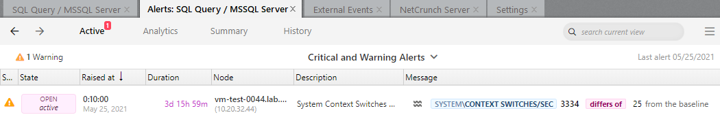
1. Active alerts
Not surprisingly, most engineers mention the active alerts window as the first one they study when opening the administration console in the morning. After a brief glimpse at the network atlas summary to check for any obvious burning points, the next task is usually going through and clearing the alarms generated overnight; some alarms need just simple acknowledgment, and others could require more hands-on attention. Active alerts view helps concentrate on what's still a problem and may need to be taken care of by one of the IT team members.
Depending on your IT team structure, you may have resource owners that want to receive only messages from the devices/servers used in their daily business. One of the IT managers recommends determining the alarms that each team member is responsible for, based on relevant monitoring packs. She set up different notifications based on the alarm levels (critical, warn & info), and then she could control how those notifications were sent to users (email or SMS, repeating or not). For example, when they stand up a new SQL instance, it was defined as a new node, got the SQL pack assigned and the resource owners would start getting their required notifications.
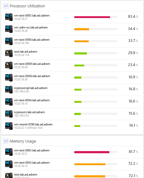
2. Custom network views and maps
Several admins mention how much they rely on custom network views. One of the admins likes being able to roll his own views for SNMP data. He has customized views for NetApp storage appliances and Cisco ASA. For example, he has included a storage SNMP event for the NetApp storage appliances to receive warnings when disk space is low on a CIFS share or iSCSI LUN. These types of warnings are available via SMS, email, and visually on the NetCrunch map. Another engineer finds custom maps very handy for performing certain tasks, such as a custom view for UPS’es that displays the status of all monitored UPSs in one glance. He has created similar views for Windows servers, Cisco switches, and storage appliances as well.
A network engineer responsible for a school network recalls how layer 2 maps and switch port maps help him win over some students' tricks who repeatedly try loosening network cables on classroom printers just enough to disconnect them but the cables are still in the socks so it does not look disconnected on the outside. Another problem he mentioned was LAN connectors that would paralyze the network at the cores with a short circuit, these were daily occurrences that he needed to be alerted about and fix on the spot. He found port mapping views useful for fast troubleshooting and localizing the disconnected cable and going directly to a particular printer to reattach it. He knew each part of the network, having built it himself, but automatic switch port maps helped him transfer his network knowledge, especially when preparing for his retirement and training a new colleague to take over his responsibilities.
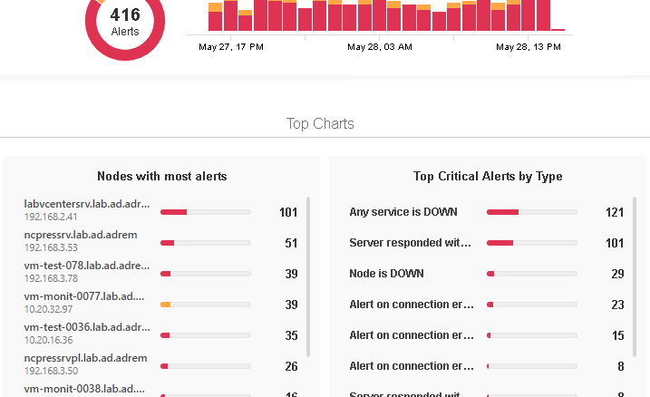
3. Top charts
Top charts are often called a standup event - it is an urban legend among our integrators and consultants that whenever they install a trial version of NetCrunch at the potential customer site and display top charts view for the local network, one of the engineers present at the meeting quickly stands up and rushes out of the meeting room to fix or check something in the network. NetCrunch users like the fact that they can customize top charts to filter out slow but less important devices (such as workstations or devices from the test lab) and have a top chart view with critical resources automatically sorted by most utilized/slowest/drained etc.
After identifying the most problematic nodes, systems, or services in your network, you can analyze their performance in the alert analytics window, which can help you identify nodes that may work right now but their overall performance is spotty or you wish to take a longer look to decide if you need to plan or prepare some action related to them in the near future.
4. Alerts: Analytics window
The analytics window gives you a broader insight into what's going on with your critical devices - for example, take a closer look at a node that is on again, off again frequently, and investigate the reason for it. You might not detect this fact in the active alerts window because when the node goes up, it clears the 'down' event and it is no longer visible in the active alerts view. But in the analytics view, you could see the list of all alerts for this node and drill down to the root cause of this behavior.
5. Monitoring issues
Finally, in the neverending quest for the all-green network status dashboard, the monitoring issues view helps identify resources that need your intervention to make it possible for NetCrunch to collect their health metrics. Whether it is an incorrect or missing password or insufficient access rights, monitoring issues are the view that helps you verify that your monitoring coverage is complete. It makes sense to check this window to finetune your monitoring and make sure that NetCrunch has all the necessary credentials and rights to track the data that you want it to. You can select multiple nodes at once if you want to assign them the same credentials.
What are your favorite views or the ones that you find most informative? Please share it with us!
- [18.06.2020]How to monitor failed login attempts in Linux
One of the things administrators often do is check multiple failed login attempts in Linux. Monitoring them allows you to assess whether illegal or unwanted attempts to our network have occurred. In this article, we will show you how to track it automatically using NetCrunch.
- [08.02.2019]SNMP monitoring features in NetCrunch
There is a lot of the ways of how we can monitor the condition, performance and availability of the devices with available SNMP service running on them. Learn how to gather the counters and states from various devices with the tools available in the NetCrunch.
- [06.12.2018]Alert Escalation Scripts
Define and customize how NetCrunch generates events, triggers alerts, and executes actions based on monitoring detections, metrics, and device status.
- [19.11.2018]Network Auto-Discovery
NetCrunch discovers all your critical IT infrastructure and deploys foundation monitoring strategies 20-50 times faster than other Network Monitoring Systems. Automatically discover new devices as you deploy them, without having to reconfigure your monitoring.
- [06.07.2018]Analyze Windows failed login events with a custom log view
Use NetCrunch to monitor and display failed logon activity on all Windows machines in your network by monitoring Windows Event Log.
- [28.03.2018]Remote Sensor Node in NetCrunch
Learn concepts and usage of Remote Probe Node - new type of node added in Netcrunch 10.
- [12.02.2018]Process Monitoring with NetCrunch WMI Sensors.
Learn how to configure a node-specific WMI Object sensor to monitor a specific Windows process and generate an event when the process is restarted. This sensor-based monitoring strategy leverages the uniqueness of PID, against the generic name of a process.
- [05.10.2017] Flexible alerting - using Baseline Threshold triggers in NetCrunch
NetCrunch offers a variety of event trigger types that can be assigned to alert counters. They vary in approach giving you the flexibility to describe unique behaviors and ultimately generate the event or alert you require. This article describes the Baseline Threshold alert trigger and provides a description of the technique and use case.
- [09.05.2022] 7 types of data to include in your network documentation
Here's a handy list of aspects that need to be documented and tracked for changes. When transferring to another position, preparing for retirement, or even planning for vacation without constant calls from your colleagues or boss - here's what you need to dump from your brain into an outside data store.